Wednesday, August 1, 2012

gala invitation

Last year, I was asked to design the invitation and collateral materials for a gala hosted by the University of Oregon to honor local leaders (read more here and here) and everyone was thrilled with the results. So thrilled, in fact, that they asked me to incorporate elements from last year into this year's design. And I was more than happy to oblige!

Starting with the save-the-date postcard, I changed the format and updated the color palette and typography. While green is definitely a UO color, using a lime/chartreuse version of it instantly sets a more modern tone.

I also used a tone-on-tone damask pattern for texture and elegance and added a curved border to enclose the event logo, which they chose to reuse from last year's design.

The invitation itself was presented inside a custom die cut folder of metallic silver cover stock that had a sticker with the logo and damask pattern applied to the front.

Once opened, the folder revealed a die cut invitation that matched the shape of the logo's border. It was glued in place above the pocket, which contained an informational card with bios of both recipients as well as the reply card and envelope.


While the package as a whole was quite stately and elegant, the use of a sans serif font (Helvetica Neue Thin) and color (PMS 583) gave the invitation a distinctly modern vibe.

My favorite part? The little round sticker used to seal the folder! Such a simple little thing, but it's what gave this suite the final finishing touch.


Wednesday, July 25, 2012

letters of appeal – part 3

A couple months ago, I shared with you two of the letters of appeal I designed for the University of Oregon 2011-2012 fiscal year (view them here and here) so today I thought I'd share the third.

This particular letter was sent out late spring and a continuation of the visual theme I developed in the preceding fall and year-end mailers.


While using the same angled band of bright yellow color from the fall mailer, this time I also added a stripe pattern and used it along the edge of the page to give it a bit of spring flair.


I incorporated photos from last summer's shoot (with David Loveall) into a side bar on the front of the letter. On the back, I echoed the horizontal tagline treatment by using panoramic shots, creating a pleasing contrast to the front.

The first of this fiscal year's mailers has already been sent to the printer and development of the subsequent mailers is in full swing. Stay tuned for updates on those later this year.


Tuesday, July 17, 2012

one more for my shelf

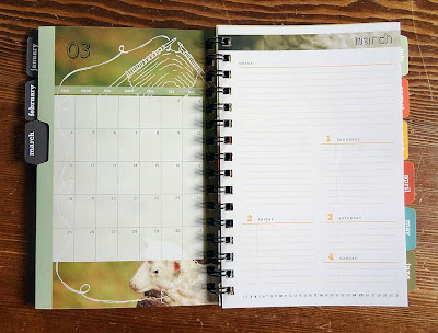
Last week I practically tripped over a super heavy box delivered to my door step. After hauling it inside and wondering what I might have purchased online that slipped my mind, I discovered it was a winner's trophy from the Summit Awards for the design of my day planner!
This is the fourth year that my collaboration with printer and paper companies has resulted in winning a design award, and every year I've been honored and thrilled to receive this symbol of recognition.

This time the award was for the 2012 day planner I designed. Instead of creating a series of illustrations in my usual style, I decided to use my photography and enhance it with thematic doodles, if you will.  

The French fold cover was printed on kraft-colored stock with a double hit of white ink while the rest of the pages were bright white paper. The monthly tabs provided functionality as well as a punch of color.
The planner was well received among my clients last December, and I personally love using it every day! Believe it or not, it's already time to start working on the next one...

Collaborators:
Brown PrintingNeenah PaperWCP Solutions

Wednesday, July 11, 2012

accordion-fold brochure

One of my clients recently asked me to design a leave-behind brochure to showcase some of their products. They specifically requested an accordion fold, which is in essence a long zig-zag fold – the perfect fold for this particular project.
I worked with Brown Printing to determine the overall size and number of panels. We wanted to show as many different office chairs as possible without going too small, so we settled on a 16-panel brochure that folded up to a little 3.5" square.
Each panel showed a single chair, along with the product name and specific item number, which referenced a short price list on the back panel.
This tiny brochure has made a huge impact – the client has already had to order a reprint twice! Their sales reps simply love having a small leave-behind that gives a quick overview of what the company is all about: office chairs.

Thursday, July 5, 2012

wine tasting invitation

I love designing event invitations – it gives me a nice little break from the more corporate projects I usually am working on.

Often the event itself will help dictate the design direction, as was the case with the winery tour and wine tasting event that the University of Oregon recently organized for some of its donors.

I started by sketching out some design directions and presenting those to the client. Then I developed their chosen design on the computer and applied a couple rounds of revisions before sending files to the printer.

I used elegant typography, a two-color palette and a pinstripe pattern to set the tone for this somewhat upscale social event.
 
Electronic or phone RSVPs meant that no reply card was needed, which kept things simple in terms of design and printing costs.

The cursive font is one of my current favorites and was a perfect fit for this project, since the ligatures and embellishments nicely mimicked grape vine tendrils.
So the next time you're in need of a special event invitation, consider using a custom design for a little extra pizzazz – you know where to find me!

Tuesday, June 26, 2012

online printing – business cards

These days there are lots of options when it comes to printing. My favorite source remains using a reputable local print shop (nothing beats being able to walk in to view proofs, attend press checks or simply talk through your project with the folks who'll be running the presses).

But sometimes the best solution may be to use an online resource. I've discovered that the old adage "you get what you pay for" holds true here as much as anywhere. I won't call out the companies that I would strongly advise against (email me if you really must know) but I have no qualms about singing the praises of one particular shop: Moo.

Just take a look at these delicious cards I recently designed:

The colors printed exactly as desired, the paper is thick with a nice mat finish, and the overall quality reinforces the professional image my client wanted to capture.


They even offer tiny mini cards (which make great little product tags) and often have a discount code for free shipping or even free cards (the current code is "MINI20" for 20% off your order of minis).


PS: The size of Moo's business cards is slightly different from the standard size so make sure you use their downloadable templates or online design program. Or call me!

Wednesday, June 20, 2012

fiery campaign collateral

A week from today is the start of this year's Oregon Bach Festival!
Preparations are in high gear and I'm busily designing ads, banners, t-shirts and the like while all the main print collateral was completed earlier this year.

We started working on the theme graphics and image search way back in January. The flame image was a perfect fit: the flame itself representing both power and passion, reinforced by the blue and orange (opposites on the color wheel!) and the stark contrast between the intense vibrancy of the colors and rich black background.
The first item I designed was the season poster that's displayed all around town. Then came the brochure, for which I created a clean and simple grid to make the huge amount of information easier to find and digest.
The look and feel was subsequently applied to smaller posters as well as postcards, rack cards, banners, invitations, email headers, social media, and so forth.

It's always exciting to see all the season materials come together as one unified look – plus after months of anticipation, the fabulous concerts and events are just around the corner!

The festival has really expanded its physical reach so whether you're on the coast, in the valley or even the mountains, there's bound to be a venue near you where you can enjoy some of this year's amazing musical talents! Click here for a complete schedule.

Tuesday, June 12, 2012

welcome, OHSU

I have some exciting news to share: after going through a lengthy RFP and vetting process, Defteling Design is now an official approved vendor for Oregon Health & Science University (OHSU)!

Throughout the last few years, I had already done some pro-bono design work for Todd's department (the OHSU Library) and by coincidence, the Library turned out to be my first official OHSU client, too!

One of Todd's co-workers was in charge of an on-campus conference and needed help with the program book, which was used to provide information on 175+ poster presentations, 140 oral presentations and three keynote speakers.

She had already designed the square Research Week logo, a play on the periodic table. I simply expanded on that.
 
For the cover, I created  an abstracted "empty" periodic table that I overlaid as a subtle pattern over a Kraft paper texture. I also introduced a thick black bar with a pointed right edge and used that throughout the program to highlight important content.
Because of the relatively small quantity, this program would be printed digitally, which meant I could use that same Kraft paper texture as a design element on all the interior pages. I proposed the wire-o binding to give the piece a bit of a note book feel (we even added a dozen or so empty pages for notes).
To give this book a bit more physical heft, I wanted a really thick paper for the covers. Because a digital press has fairly limited choices when it comes to cover weight stock, I opted for a French fold: printing each cover and inside cover as one wide sheet, then folding them in half. VoilĂ : extra-thick covers!
I'm very excited to see what my next OHSU project will be!

Wednesday, June 6, 2012

letters of appeal – part 2

As promised in my last post, today I'm sharing another letter of appeal for the University of Oregon's Annual Giving Program.
 
This mailer uses the same tagline and color palette established in the first mailer but expands on the use of photography, showing students engaged in various activities across campus.
 
The photo shoot for these mailers is always a lot of fun and usually encompasses one or two full days of shooting. It takes a lot of organization to scout locations, create a shot list, and manage a group of a dozen or more students (our models). But all that work pays off in the end when I get the hard drive filled with exactly the shots I need to make the designs really come to life.

Monday, June 4, 2012

letters of appeal – part 1

As I'm getting started on designing new letters of appeal for the upcoming school year, I realize that I haven't shown any of last year's letters that I designed for the University of Oregon's Annual Giving Program, one of my long-standing clients.

Well, let me fix that right now!

Since 2003, I have helped UO Annual Giving design anywhere from one to four direct mail packages that ask a variety of targeted demographics to help support students in their academic pursuits. Usually there is one central message around which I will then design all of that year's letters so that there's a cohesive look that is reinforced with each mailing.

Last Fall, we kicked off the academic year with this:
The converted #10 envelope introduces the "Every gift. Every dream. Every year." tagline with a specific typographic treatment that was used on all subsequent mailers, too.
To brighten up the standard UO color palette of green and yellow, I chose a fresh lime green that was used to emphasize the word "every" in the background of the tagline.

I also used a yellow line that angled into and out of the letter at the top and bottom, creating a bit of a 3D effect to entice the reader to turn the page.
On the back, the tagline is front and center, sandwiched between large photos of students enjoying campus life.
Working on these letters of appeal is always a fun challenge. The core message does not change so each year I have to find new ways to communicate the same basic idea: give now to help students achieve their academic dreams.

Stay tuned for my next post, where I'll share the second mailer in this series.