
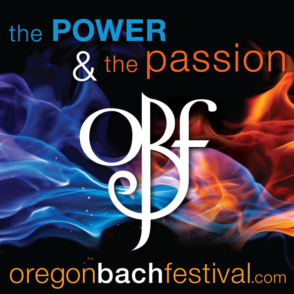
We started working on the theme graphics and image search way back in January. The flame image was a perfect fit: the flame itself representing both power and passion, reinforced by the blue and orange (opposites on the color wheel!) and the stark contrast between the intense vibrancy of the colors and rich black background.


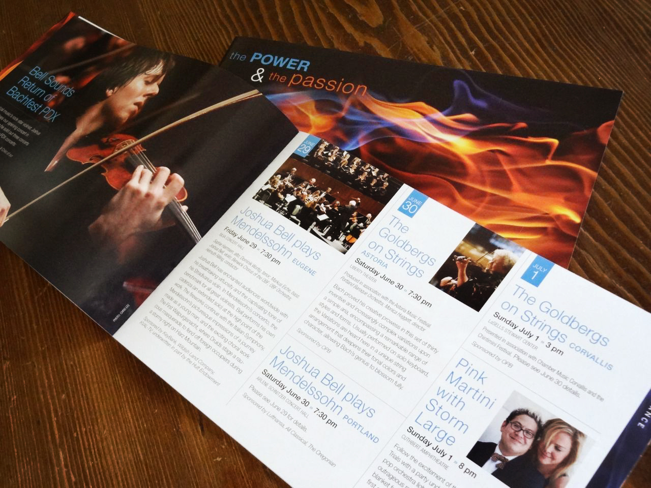

It's always exciting to see all the season materials come together as one unified look – plus after months of anticipation, the fabulous concerts and events are just around the corner!

The festival has really expanded its physical reach so whether you're on the coast, in the valley or even the mountains, there's bound to be a venue near you where you can enjoy some of this year's amazing musical talents! Click here for a complete schedule.
No comments:
Post a Comment