Thursday, September 27, 2012

behind the scenes at a photo shoot

Yesterday I found myself traipsing all over the University of Oregon campus, art directing a long-planned photo shoot with the ever-so-talented David Loveall. We do these shoots just about every year for the UO Annual Giving Program (you can see last year's projects for them here, here and here).

I thought it might be fun to give you a bit of a behind-the-scenes peek at our photo shoot so I snapped some quick shots throughout the day.

As far as photo shoots go, ours are actually quite casual. No hair & make-up artists, no wardrobe or prop department, no prior head shots and model screening. The kids are all 100% real UO students and we prefer them au naturel.

While we had no big movie trailer to retreat into, we did get lunch catered, right outside the EMU (student center).
After gobbling up a turkey sandwich, some chips and a cookie, it was on to the next location. By the end of the day, we had shot roughly 1,000 images in nearly 20 campus locations – in part thanks to advance location scouting and thorough shot list preparation.

My favorite location was shooting inside the Craft Center in the ceramics studio. The light was simply amazing thanks to a huge wall of windows and skylights. While none of our three models had ever thrown a pottery wheel, a very patient student (who was trying hard to get her own work done amidst our shooting) and a kind and knowledgeable studio manager (who was a natural instructor) were willing to step in, thus making sure we got some great shots.


And here's my favorite shot of David: flat on his stomach – in the wet grass! – to get just the right angle of the students gathered down the field in the sun. Thanks, David! Not only are you a super photographer, you're also quite the trooper :)

Wednesday, September 19, 2012

what's for dinner?

It's barely starting to feel like fall but I've been thinking about Thanksgiving dinner for months! Not because I'm an avid cook (far from it!) but because I've been working on the holiday line-up for Harry's Fresh Foods.

Harry's needed a brochure that presented their food service holiday line-up in one easy-to-read brochure that's packed with information and appetite appeal as well as order form.

So I designed the brochure to look like a restaurant menu, complete with linen fabric texture and Harry's signature illustration used as a subtle background throughout.


As the main font, I chose Carolyna Pro Black, which has the elegance of a script mixed with the ligatures and flourishes of custom calligraphy.


I blended the plate shots with the background in Photoshop, creating soft vignettes that added to the festive holiday feel.


And just to show you what a departure this holiday menu is from the standard product sheets I designed for Harry's, here's a quick comparison:


I'd say let the holidays begin!

Wednesday, September 12, 2012

cheers to beer

My day-to-day work for Harry's Fresh Foods usually involves designing or updating print collateral for use by their sales force but a few weeks ago, they asked me to help them with a special events project. Fun!

You may remember seeing the logo I designed for their 2012 Ski Summit here so now I get to share some of the ways it was implemented.


The main use was on beer steins that were sent to prospective attendees of the event. The logo had to be converted to strictly black and white so it could be engraved onto the glass.


I then used it on the actual invitation, which took the form of a full-color, 4-panel brochure detailing the itinerary of the 2-day event (which included a pub crawl, since no visit to Portland is complete without at least one pint of local micro brew!).


I'm quite pleased with the result – hopefully, the invited guests are, too!

Tuesday, September 4, 2012

another award – creativity 41

I love getting mail. Naturally, when opening my mail box, I prefer to find a lovely handwritten note from a dear friend than a bill or yet another invite to bundle my phone and cable...but best of all is when there's a package.

Seeing a plain brown box waiting patiently at my door step always gets me giddy with excitement. Did someone send me a present? Did I sleep walk and order that as-seen-on-TV gadget?

Last week I found one of these boxes tucked away behind some bushes next to the front door (I must not have been home when the UPS man made his delivery) and I eagerly tore away the tape, revealing my very own copy of Creativity 41.


Having a collection of award-winning designs is always a great design reference but what makes this book special is that it includes one of my award-winning designs! A magazine ad, to be precise, that I worked on with copywriter extraordinaire Erin Codazzi (you may remember reading about it here).


What makes it even more special is that the book itself is actually a pretty cool design. While the use of pattern is a bit much for my taste, I do love the fact that the paper edges were printed with stripes. And, of course, that fabulous diecut "1" on the front cover.


Yep, I love getting mail. Can't wait to see what this week's mail brings me!


Thursday, August 23, 2012

logo love

One of the best ways to make a good first impression is to have a strong, memorable logo mark. Your company's logo, after all, serves as the face of your company when you can't be there in person.
Over the last 10 years, I've been entrusted to design or refresh many of my clients' corporate identity and it's always such a rewarding process to see a logo come to life, actively making concept sketches turn into computerized icons that blossom into full-fledged logo marks complete with typography and color.

I thought I'd share a few of the logos I've been fortunate to work on recently.


Ekko Workshop is a brand new division of Ekko Mobiles, which designs the most amazing large-scale mobile installations. Wanting to take their concepts to the wholesale market with desktop-sized models, Ekko asked me to create a mark that stayed true to their down-to-earth, "workshop" roots, so I chose strong, modern typography and developed a simple icon that feels somewhat industrial.

Powell Boulevard Veterinary Clinic has been my fur family's trusted vet since we first moved to Portland 10 years ago. So when they asked me to design a logo for their brand new Eastside Pet Rehabilitation Center, I jumped at the chance. They had done their research and already knew they wanted a very illustrative logo that incorporated iconic East Portland/outdoor imagery, a slightly retro/travel poster look, and oh, yes, a dog! Because of budget constraints, I used a combination of stock art (trees) and custom illustration (dog and Mt. Hood) with early 20th century inspired typography.

The 2012 Ski Summit is an in-house marketing event hosted by Harry's Fresh Foods that targets restaurant managers from high-end ski resorts across the country. Thinking back to my childhood experiences skiing (which weren't all that great despite taking place in the Swiss Alps), I decided to mimic those ski patches all my class mates were so eager to sew onto their parkas. Retro-inspired graphics and a sporty shield combined to create a memorable logo for this fun event.

When Cox Marketing asked me to help out with a logo project for her client, I was more than happy to jump in. Sologic was the new name of a company specializing in root cause analysis so I started with concepts for the iconography that would reflect their specific process. The end result is a series over overlapping fields that are grounded by a solid base. I combined modern typography that communicates their technological expertise with a simple yet fresh color palette, and the result is an intriguing mark that makes a lasting impression.

If you're an avid reader of my blog, then you already know that the University of Oregon's Annual Giving Program has been one of my clients for over decade. Every year I design their letters of appeal, and in the last few years we've tried to develop a visual theme that ties together all the different mailings they send out during the academic year. This year, the tagline stayed the same as last year, but I gave it a fresh new look by using a slightly futuristic type face and a twist on the traditional sunflower yellow and kelly green UO colors. The first two mailers recently went to print so stay tuned on examples of how this emblem "in action."

For more examples of logo design, please visit my portfolio or get in touch – I'm always happy to show you my work in person!

Wednesday, August 15, 2012

picnic time

Whether at home or at work, it feels great to know you're appreciated, doesn't it? It feels even better when they throw you a big party!

That's where the company picnic comes in: many organizations use the relaxed atmosphere of a casual summer get together to thank their employees for all their hard work.

Harry's Fresh Foods took it a step further by holding their picnic at Oaks Bottom, a local carnival-style amusement park that reminds you of the good old days.

So yes, when Harry's asked me to design the invitation postcard using the "got soup? got fun!" tagline, I could taken inspiration from the carnival location using color fanfare, stars & stripes and even clowns. 


Instead I chose to keep it simple and understated, only hinting at nostalgia through use of typography. Because as we all know, sometimes less is more!

Tuesday, August 7, 2012

gala program

To follow up on last week's post about the gala invitation for the University of Oregon,  I thought that today I'd share the program book I designed for the event.

I updated last year's square format with this year's color palette, damask pattern and logo border. The metallic paper worked especially well with the dark pattern, giving it extra depth and lustre.

The inside front cover was a flood of chartreuse green while the first page featured a black pattern band behind the logo – I love the overall effect and contrast it created.

The interior pages were reformatted to reflect this year's modern typography and color while the grey stripes from the save-the-date made an appearance as a header at the top and bottom of each page.

The end result: an elegant program book that effectively reflected the prestigious nature of the event while not breaking the bank in terms of design or printing costs.

Wednesday, August 1, 2012

gala invitation

Last year, I was asked to design the invitation and collateral materials for a gala hosted by the University of Oregon to honor local leaders (read more here and here) and everyone was thrilled with the results. So thrilled, in fact, that they asked me to incorporate elements from last year into this year's design. And I was more than happy to oblige!

Starting with the save-the-date postcard, I changed the format and updated the color palette and typography. While green is definitely a UO color, using a lime/chartreuse version of it instantly sets a more modern tone.

I also used a tone-on-tone damask pattern for texture and elegance and added a curved border to enclose the event logo, which they chose to reuse from last year's design.

The invitation itself was presented inside a custom die cut folder of metallic silver cover stock that had a sticker with the logo and damask pattern applied to the front.

Once opened, the folder revealed a die cut invitation that matched the shape of the logo's border. It was glued in place above the pocket, which contained an informational card with bios of both recipients as well as the reply card and envelope.


While the package as a whole was quite stately and elegant, the use of a sans serif font (Helvetica Neue Thin) and color (PMS 583) gave the invitation a distinctly modern vibe.

My favorite part? The little round sticker used to seal the folder! Such a simple little thing, but it's what gave this suite the final finishing touch.


Wednesday, July 25, 2012

letters of appeal – part 3

A couple months ago, I shared with you two of the letters of appeal I designed for the University of Oregon 2011-2012 fiscal year (view them here and here) so today I thought I'd share the third.

This particular letter was sent out late spring and a continuation of the visual theme I developed in the preceding fall and year-end mailers.


While using the same angled band of bright yellow color from the fall mailer, this time I also added a stripe pattern and used it along the edge of the page to give it a bit of spring flair.


I incorporated photos from last summer's shoot (with David Loveall) into a side bar on the front of the letter. On the back, I echoed the horizontal tagline treatment by using panoramic shots, creating a pleasing contrast to the front.

The first of this fiscal year's mailers has already been sent to the printer and development of the subsequent mailers is in full swing. Stay tuned for updates on those later this year.


Tuesday, July 17, 2012

one more for my shelf

Last week I practically tripped over a super heavy box delivered to my door step. After hauling it inside and wondering what I might have purchased online that slipped my mind, I discovered it was a winner's trophy from the Summit Awards for the design of my day planner!
This is the fourth year that my collaboration with printer and paper companies has resulted in winning a design award, and every year I've been honored and thrilled to receive this symbol of recognition.

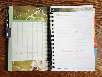
This time the award was for the 2012 day planner I designed. Instead of creating a series of illustrations in my usual style, I decided to use my photography and enhance it with thematic doodles, if you will.  

The French fold cover was printed on kraft-colored stock with a double hit of white ink while the rest of the pages were bright white paper. The monthly tabs provided functionality as well as a punch of color.
The planner was well received among my clients last December, and I personally love using it every day! Believe it or not, it's already time to start working on the next one...

Collaborators:
Brown PrintingNeenah PaperWCP Solutions