My day-to-day work for Harry's Fresh Foods usually involves designing or updating print collateral for use by their sales force but a few weeks ago, they asked me to help them with a special events project. Fun!
You may remember seeing the logo I designed for their 2012 Ski Summit here so now I get to share some of the ways it was implemented.
The main use was on beer steins that were sent to prospective attendees of the event. The logo had to be converted to strictly black and white so it could be engraved onto the glass.
I then used it on the actual invitation, which took the form of a full-color, 4-panel brochure detailing the itinerary of the 2-day event (which included a pub crawl, since no visit to Portland is complete without at least one pint of local micro brew!).
I'm quite pleased with the result – hopefully, the invited guests are, too!
Showing posts with label events. Show all posts
Wednesday, September 12, 2012
Wednesday, August 15, 2012
picnic time
Whether at home or at work, it feels great to know you're appreciated, doesn't it? It feels even better when they throw you a big party!
That's where the company picnic comes in: many organizations use the relaxed atmosphere of a casual summer get together to thank their employees for all their hard work.
Harry's Fresh Foods took it a step further by holding their picnic at Oaks Bottom, a local carnival-style amusement park that reminds you of the good old days.
So yes, when Harry's asked me to design the invitation postcard using the "got soup? got fun!" tagline, I could taken inspiration from the carnival location using color fanfare, stars & stripes and even clowns.
Instead I chose to keep it simple and understated, only hinting at nostalgia through use of typography. Because as we all know, sometimes less is more!
That's where the company picnic comes in: many organizations use the relaxed atmosphere of a casual summer get together to thank their employees for all their hard work.
Harry's Fresh Foods took it a step further by holding their picnic at Oaks Bottom, a local carnival-style amusement park that reminds you of the good old days.
So yes, when Harry's asked me to design the invitation postcard using the "got soup? got fun!" tagline, I could taken inspiration from the carnival location using color fanfare, stars & stripes and even clowns.
Instead I chose to keep it simple and understated, only hinting at nostalgia through use of typography. Because as we all know, sometimes less is more!
Tuesday, August 7, 2012
gala program
To follow up on last week's post about the gala invitation for the University of Oregon, I thought that today I'd share the program book I designed for the event.
I updated last year's square format with this year's color palette, damask pattern and logo border. The metallic paper worked especially well with the dark pattern, giving it extra depth and lustre.
The inside front cover was a flood of chartreuse green while the first page featured a black pattern band behind the logo – I love the overall effect and contrast it created.
The interior pages were reformatted to reflect this year's modern typography and color while the grey stripes from the save-the-date made an appearance as a header at the top and bottom of each page.
The end result: an elegant program book that effectively reflected the prestigious nature of the event while not breaking the bank in terms of design or printing costs.
I updated last year's square format with this year's color palette, damask pattern and logo border. The metallic paper worked especially well with the dark pattern, giving it extra depth and lustre.
The inside front cover was a flood of chartreuse green while the first page featured a black pattern band behind the logo – I love the overall effect and contrast it created.
The interior pages were reformatted to reflect this year's modern typography and color while the grey stripes from the save-the-date made an appearance as a header at the top and bottom of each page.
The end result: an elegant program book that effectively reflected the prestigious nature of the event while not breaking the bank in terms of design or printing costs.
Wednesday, June 20, 2012
fiery campaign collateral
A week from today is the start of this year's Oregon Bach Festival!
Preparations are in high gear and I'm busily designing ads, banners, t-shirts and the like while all the main print collateral was completed earlier this year.
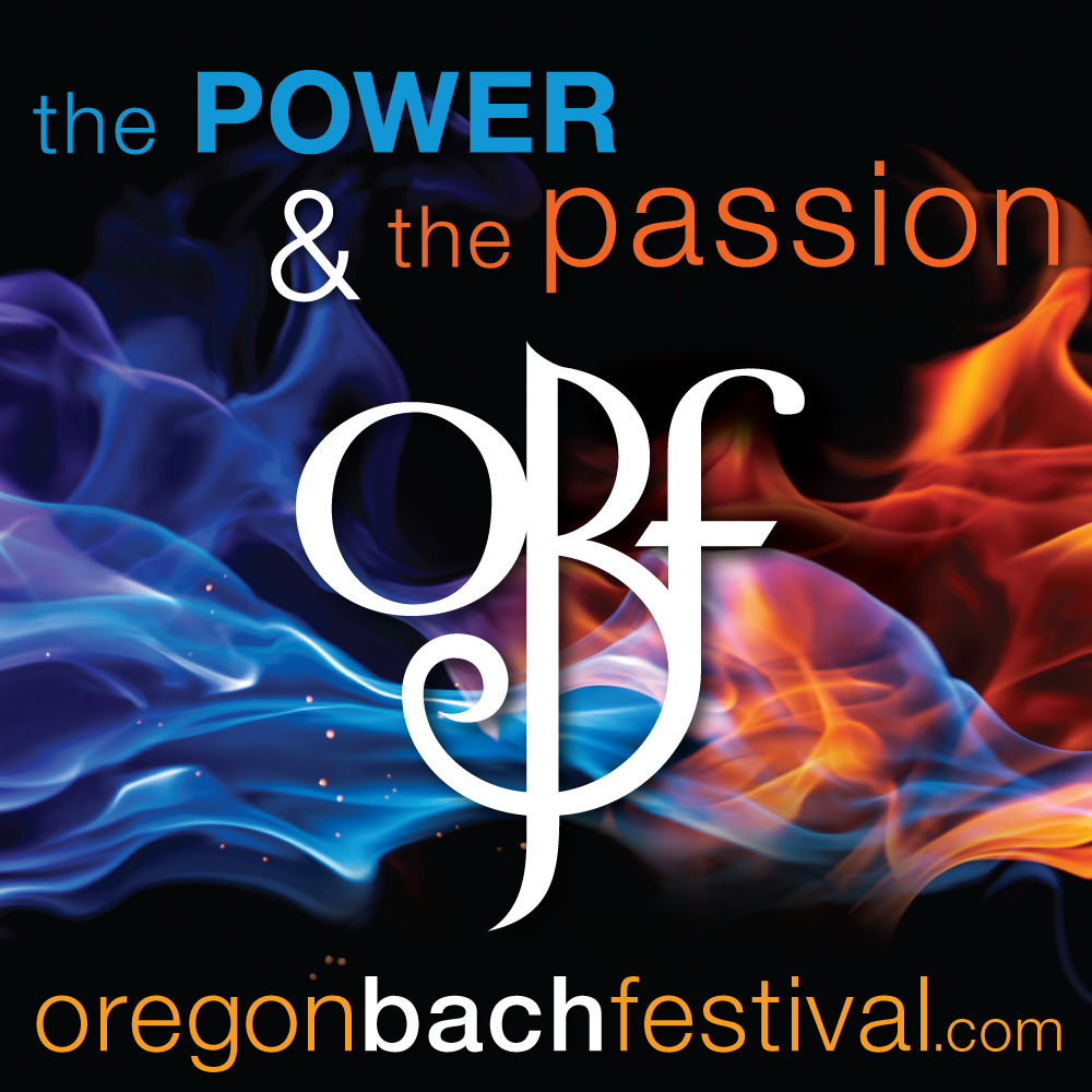
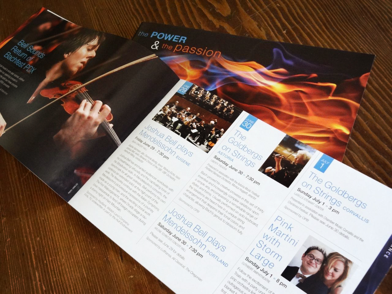
We started working on the theme graphics and image search way back in January. The flame image was a perfect fit: the flame itself representing both power and passion, reinforced by the blue and orange (opposites on the color wheel!) and the stark contrast between the intense vibrancy of the colors and rich black background.
The first item I designed was the season poster that's displayed all around town. Then came the brochure, for which I created a clean and simple grid to make the huge amount of information easier to find and digest.
The look and feel was subsequently applied to smaller posters as well as postcards, rack cards, banners, invitations, email headers, social media, and so forth.
It's always exciting to see all the season materials come together as one unified look – plus after months of anticipation, the fabulous concerts and events are just around the corner!
The festival has really expanded its physical reach so whether you're on the coast, in the valley or even the mountains, there's bound to be a venue near you where you can enjoy some of this year's amazing musical talents! Click here for a complete schedule.
Preparations are in high gear and I'm busily designing ads, banners, t-shirts and the like while all the main print collateral was completed earlier this year.
We started working on the theme graphics and image search way back in January. The flame image was a perfect fit: the flame itself representing both power and passion, reinforced by the blue and orange (opposites on the color wheel!) and the stark contrast between the intense vibrancy of the colors and rich black background.
The first item I designed was the season poster that's displayed all around town. Then came the brochure, for which I created a clean and simple grid to make the huge amount of information easier to find and digest.
The look and feel was subsequently applied to smaller posters as well as postcards, rack cards, banners, invitations, email headers, social media, and so forth.
It's always exciting to see all the season materials come together as one unified look – plus after months of anticipation, the fabulous concerts and events are just around the corner!
The festival has really expanded its physical reach so whether you're on the coast, in the valley or even the mountains, there's bound to be a venue near you where you can enjoy some of this year's amazing musical talents! Click here for a complete schedule.
Wednesday, April 6, 2011
seeing green
The University of Oregon is about to celebrate the grand opening of their new Alumni Center and needed a save-the-date postcard to spread the word. And who better to get everyone in a celebratory mood than good ol' Donald Duck himself?
Just one teeny, tiny problem: we didn't have a high-resolution version of this image.
Not to worry! After applying a few halftone filters and adding a dot pattern to the background, I ended up with a fun and festive treatment that was the perfect throwback to Donald's cartoon heritage.

Printed digitally, over-sized at 9" x 6" and finished with rounded corners, this bright and happy save-the-date is sure to grab attention!
Just one teeny, tiny problem: we didn't have a high-resolution version of this image.Not to worry! After applying a few halftone filters and adding a dot pattern to the background, I ended up with a fun and festive treatment that was the perfect throwback to Donald's cartoon heritage.

Printed digitally, over-sized at 9" x 6" and finished with rounded corners, this bright and happy save-the-date is sure to grab attention!
Wednesday, March 16, 2011
going formal
Last week the invitation for a UO black tie event were mailed out and I'm so pleased with how the suite turned out! I posted about the save-the-date postcard here, which set the tone for the rest of the design.
Picking up on the previously established color palette, typography and design elements, I decided to create a two-piece invitation. At first glance, it's simply a large square invite (7.25") but upon closer inspection, you'll notice that the two thumbnail slits on the left and right allow the top card to be removed, revealing additional information on the backer card.
This is a unique way to separate the actual event information (on the first card) from the award recipient bios (on the second card).

The suite also includes a reply card and envelope that is tucked inside the outer envelope. This outer mailer turned out beautiful, using the same Founding Father image from the save-the-date on the front of the envelope, screened back so it acts almost as a watermark.
This look was achieved by having the envelope converted, meaning I designed both the front and back, had it printed as one flat sheet, and then had it cut, folded, and glued to create the envelope.
I love designing converted envelopes since it allows you to really customize the design. However, it only makes sense financially if you're printing a decent quantity (several thousand) since there is a certain cost involved.
Up next is to design the program, name tags, table numbers, etc. We'll continue with this look but to switch things up and add an extra glamorous touch, I think we'll probably switch papers so stay tuned...

Picking up on the previously established color palette, typography and design elements, I decided to create a two-piece invitation. At first glance, it's simply a large square invite (7.25") but upon closer inspection, you'll notice that the two thumbnail slits on the left and right allow the top card to be removed, revealing additional information on the backer card.
This is a unique way to separate the actual event information (on the first card) from the award recipient bios (on the second card).
The suite also includes a reply card and envelope that is tucked inside the outer envelope. This outer mailer turned out beautiful, using the same Founding Father image from the save-the-date on the front of the envelope, screened back so it acts almost as a watermark.
This look was achieved by having the envelope converted, meaning I designed both the front and back, had it printed as one flat sheet, and then had it cut, folded, and glued to create the envelope.I love designing converted envelopes since it allows you to really customize the design. However, it only makes sense financially if you're printing a decent quantity (several thousand) since there is a certain cost involved.
Up next is to design the program, name tags, table numbers, etc. We'll continue with this look but to switch things up and add an extra glamorous touch, I think we'll probably switch papers so stay tuned...
Monday, March 14, 2011
going digital
As a designer, I love the quality created by printing a project on an offset press. But when budget, quantity or timing eliminate that option, I'm glad to know I can get great results by going digital.
Case in point is the program book I designed for a University of Oregon event. You may remember reading about the actual invitation, which was printed offset using two Pantone colors.
Now take a look at this digital print run:
The colors are amazingly close, type is crisp and the paper feels nice. Granted, paper choices are still somewhat limited when printing on a digital press but for the time and money saved, this is a perfect solution.


Case in point is the program book I designed for a University of Oregon event. You may remember reading about the actual invitation, which was printed offset using two Pantone colors.
Now take a look at this digital print run:
The colors are amazingly close, type is crisp and the paper feels nice. Granted, paper choices are still somewhat limited when printing on a digital press but for the time and money saved, this is a perfect solution.


Monday, March 7, 2011
form follows funk
Last week I battled the rush hour traffic and nasty down pours to attend this month's First Friday art walk in Eugene, Oregon.
Okay, I didn't do much walking since I only went to one gallery but it was totally worth the 5-hour stint in the car: my all-time favorite creative director and Guru of Genius Dave Funk was being honored in a retrospective at Opus VII gallery.
The place was absolutely packed with people and despite my best efforts to capture the essence of the show, my photos hardly do it justice...
One side of the wall was filled with Dave's sketches, doodles and ideas from the past 30+ years. His drawings are so cool, it was great to see them all grouped together – they are so much part of what makes Dave Dave!


The opposite wall displayed photos, work, bios, and quotes by a number of talented designers that Dave has worked with over the years. Surprisingly, the work of a dozen or so different artists hung together cohesively and came across as a single unit.

I was honored to be among this mix of graphic artists and had great fun watching people engage with my work.


In between these two long walls were several displays inviting the viewer to partake in mini design projects. There was also a tribute to my former teacher and mentor Thomas Rubick and local design legend Chris Berner.

Kudos to the team who put this show together – well done, very well done!
Okay, I didn't do much walking since I only went to one gallery but it was totally worth the 5-hour stint in the car: my all-time favorite creative director and Guru of Genius Dave Funk was being honored in a retrospective at Opus VII gallery.
The place was absolutely packed with people and despite my best efforts to capture the essence of the show, my photos hardly do it justice...One side of the wall was filled with Dave's sketches, doodles and ideas from the past 30+ years. His drawings are so cool, it was great to see them all grouped together – they are so much part of what makes Dave Dave!


The opposite wall displayed photos, work, bios, and quotes by a number of talented designers that Dave has worked with over the years. Surprisingly, the work of a dozen or so different artists hung together cohesively and came across as a single unit.
I was honored to be among this mix of graphic artists and had great fun watching people engage with my work.

In between these two long walls were several displays inviting the viewer to partake in mini design projects. There was also a tribute to my former teacher and mentor Thomas Rubick and local design legend Chris Berner.
Kudos to the team who put this show together – well done, very well done!
Subscribe to:
Posts (Atom)