Showing posts with label photography. Show all posts

Thursday, September 27, 2012

behind the scenes at a photo shoot

Yesterday I found myself traipsing all over the University of Oregon campus, art directing a long-planned photo shoot with the ever-so-talented David Loveall. We do these shoots just about every year for the UO Annual Giving Program (you can see last year's projects for them here, here and here).

I thought it might be fun to give you a bit of a behind-the-scenes peek at our photo shoot so I snapped some quick shots throughout the day.

As far as photo shoots go, ours are actually quite casual. No hair & make-up artists, no wardrobe or prop department, no prior head shots and model screening. The kids are all 100% real UO students and we prefer them au naturel.

While we had no big movie trailer to retreat into, we did get lunch catered, right outside the EMU (student center).
After gobbling up a turkey sandwich, some chips and a cookie, it was on to the next location. By the end of the day, we had shot roughly 1,000 images in nearly 20 campus locations – in part thanks to advance location scouting and thorough shot list preparation.

My favorite location was shooting inside the Craft Center in the ceramics studio. The light was simply amazing thanks to a huge wall of windows and skylights. While none of our three models had ever thrown a pottery wheel, a very patient student (who was trying hard to get her own work done amidst our shooting) and a kind and knowledgeable studio manager (who was a natural instructor) were willing to step in, thus making sure we got some great shots.


And here's my favorite shot of David: flat on his stomach – in the wet grass! – to get just the right angle of the students gathered down the field in the sun. Thanks, David! Not only are you a super photographer, you're also quite the trooper :)

Wednesday, July 25, 2012

letters of appeal – part 3

A couple months ago, I shared with you two of the letters of appeal I designed for the University of Oregon 2011-2012 fiscal year (view them here and here) so today I thought I'd share the third.

This particular letter was sent out late spring and a continuation of the visual theme I developed in the preceding fall and year-end mailers.


While using the same angled band of bright yellow color from the fall mailer, this time I also added a stripe pattern and used it along the edge of the page to give it a bit of spring flair.


I incorporated photos from last summer's shoot (with David Loveall) into a side bar on the front of the letter. On the back, I echoed the horizontal tagline treatment by using panoramic shots, creating a pleasing contrast to the front.

The first of this fiscal year's mailers has already been sent to the printer and development of the subsequent mailers is in full swing. Stay tuned for updates on those later this year.


Tuesday, July 17, 2012

one more for my shelf

Last week I practically tripped over a super heavy box delivered to my door step. After hauling it inside and wondering what I might have purchased online that slipped my mind, I discovered it was a winner's trophy from the Summit Awards for the design of my day planner!
This is the fourth year that my collaboration with printer and paper companies has resulted in winning a design award, and every year I've been honored and thrilled to receive this symbol of recognition.

This time the award was for the 2012 day planner I designed. Instead of creating a series of illustrations in my usual style, I decided to use my photography and enhance it with thematic doodles, if you will.  

The French fold cover was printed on kraft-colored stock with a double hit of white ink while the rest of the pages were bright white paper. The monthly tabs provided functionality as well as a punch of color.
The planner was well received among my clients last December, and I personally love using it every day! Believe it or not, it's already time to start working on the next one...

Collaborators:
Brown Printing • Neenah Paper • WCP Solutions

Tuesday, June 26, 2012

online printing – business cards

These days there are lots of options when it comes to printing. My favorite source remains using a reputable local print shop (nothing beats being able to walk in to view proofs, attend press checks or simply talk through your project with the folks who'll be running the presses).

But sometimes the best solution may be to use an online resource. I've discovered that the old adage "you get what you pay for" holds true here as much as anywhere. I won't call out the companies that I would strongly advise against (email me if you really must know) but I have no qualms about singing the praises of one particular shop: Moo.

Just take a look at these delicious cards I recently designed:

The colors printed exactly as desired, the paper is thick with a nice mat finish, and the overall quality reinforces the professional image my client wanted to capture.


They even offer tiny mini cards (which make great little product tags) and often have a discount code for free shipping or even free cards (the current code is "MINI20" for 20% off your order of minis).


PS: The size of Moo's business cards is slightly different from the standard size so make sure you use their downloadable templates or online design program. Or call me!

Wednesday, June 20, 2012

fiery campaign collateral

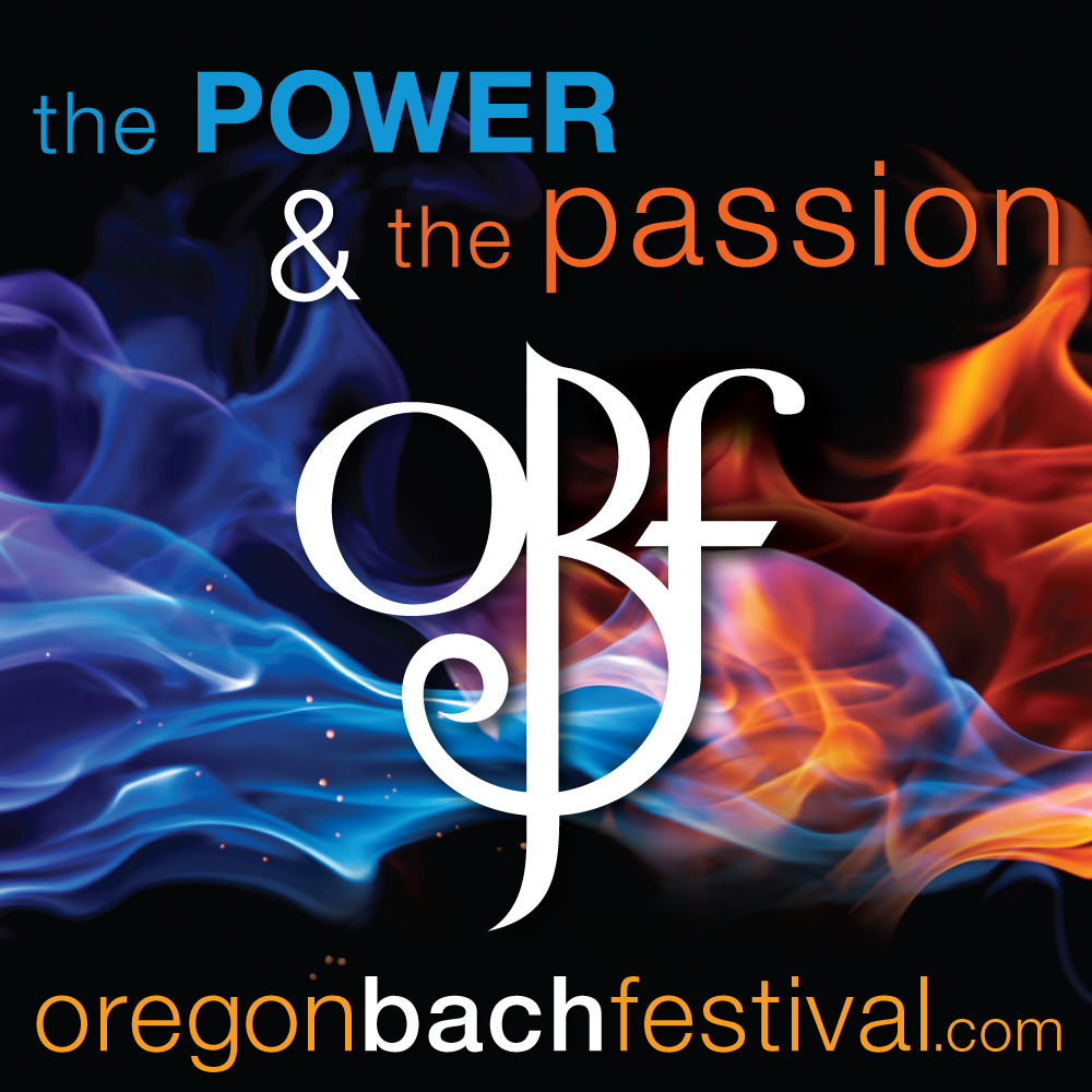
A week from today is the start of this year's Oregon Bach Festival!
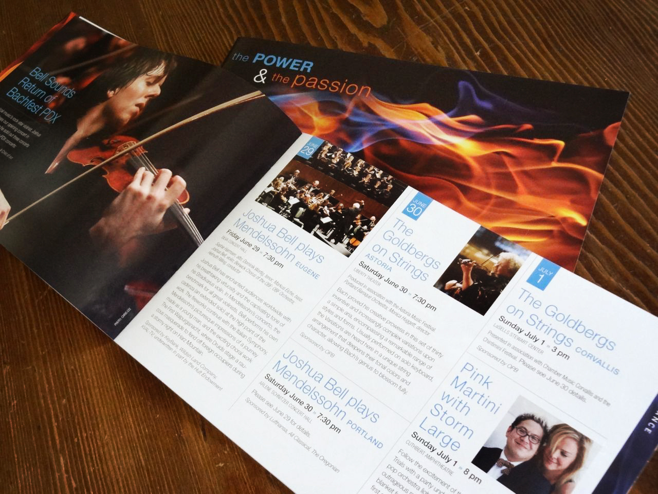
Preparations are in high gear and I'm busily designing ads, banners, t-shirts and the like while all the main print collateral was completed earlier this year.

We started working on the theme graphics and image search way back in January. The flame image was a perfect fit: the flame itself representing both power and passion, reinforced by the blue and orange (opposites on the color wheel!) and the stark contrast between the intense vibrancy of the colors and rich black background.
The first item I designed was the season poster that's displayed all around town. Then came the brochure, for which I created a clean and simple grid to make the huge amount of information easier to find and digest.
The look and feel was subsequently applied to smaller posters as well as postcards, rack cards, banners, invitations, email headers, social media, and so forth.

It's always exciting to see all the season materials come together as one unified look – plus after months of anticipation, the fabulous concerts and events are just around the corner!

The festival has really expanded its physical reach so whether you're on the coast, in the valley or even the mountains, there's bound to be a venue near you where you can enjoy some of this year's amazing musical talents! Click here for a complete schedule.

Wednesday, June 6, 2012

letters of appeal – part 2

As promised in my last post, today I'm sharing another letter of appeal for the University of Oregon's Annual Giving Program.
 
This mailer uses the same tagline and color palette established in the first mailer but expands on the use of photography, showing students engaged in various activities across campus.
 
The photo shoot for these mailers is always a lot of fun and usually encompasses one or two full days of shooting. It takes a lot of organization to scout locations, create a shot list, and manage a group of a dozen or more students (our models). But all that work pays off in the end when I get the hard drive filled with exactly the shots I need to make the designs really come to life.

Tuesday, November 8, 2011

sneak peek: day planner

For the last few years, I've collaborated with Brown Printing, WCP Solutions and Neenah Paper to produce a calendar that we could distribute among our clients as a promotional tool and thank you gift.

After working on this project since May, I was super excited to finally see my designs in print during yesterday's press checks.

I'm thrilled with the way everything is coming together:

Stay tuned for pix of the final product later this month!

Wednesday, February 9, 2011

palm springs glam

Design is about so much more than simply arranging elements on a page. I was reminded of this again this week when I picked up samples of an invitation I designed for the University of Oregon.

This particular event takes place in Palm Springs so it made perfect sense to use photography that mirrored the location. During my image search, I came across this image (from iStockPhoto) and thought it was perfect: a big tropical palm tree drenched in rays of sunshine. The lens glare was a nice bonus, adding a touch of realism.

To take that sense of realism even further, I suggested we print the invite on a metallic paper to really add depth and brightness to the image. And boy, was that ever the right call: the Petallics paper by Aspire really made the photo come to life – you can practically feel the sun blind your eyes!
Okay, so it's hard to show in these photos but trust me, if you want to add some glam and some depth to your next project, consider using this paper. The nice thing is that it's offered for both offset and digital applications (we printed the invite digitally while the envelope was a 2-color offset job).