A couple months ago, I shared with you two of the letters of appeal I designed for the University of Oregon 2011-2012 fiscal year (view them here and here) so today I thought I'd share the third.
This particular letter was sent out late spring and a continuation of the visual theme I developed in the preceding fall and year-end mailers.
While using the same angled band of bright yellow color from the fall mailer, this time I also added a stripe pattern and used it along the edge of the page to give it a bit of spring flair.
I incorporated photos from last summer's shoot (with David Loveall) into a side bar on the front of the letter. On the back, I echoed the horizontal tagline treatment by using panoramic shots, creating a pleasing contrast to the front.
The first of this fiscal year's mailers has already been sent to the printer and development of the subsequent mailers is in full swing. Stay tuned for updates on those later this year.
Wednesday, July 25, 2012
Tuesday, July 17, 2012
one more for my shelf
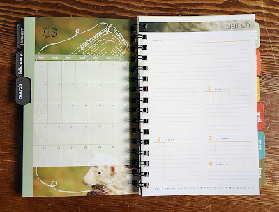
Last week I practically tripped over a super heavy box delivered to my door step. After hauling it inside and wondering what I might have purchased online that slipped my mind, I discovered it was a winner's trophy from the Summit Awards for the design of my day planner!
This is the fourth year that my collaboration with printer and paper companies has resulted in winning a design award, and every year I've been honored and thrilled to receive this symbol of recognition.
This time the award was for the 2012 day planner I designed. Instead of creating a series of illustrations in my usual style, I decided to use my photography and enhance it with thematic doodles, if you will.
Collaborators:
Brown Printing • Neenah Paper • WCP Solutions
This is the fourth year that my collaboration with printer and paper companies has resulted in winning a design award, and every year I've been honored and thrilled to receive this symbol of recognition.
This time the award was for the 2012 day planner I designed. Instead of creating a series of illustrations in my usual style, I decided to use my photography and enhance it with thematic doodles, if you will.
The French fold cover was printed on kraft-colored stock with a double hit of white ink while the rest of the pages were bright white paper. The monthly tabs provided functionality as well as a punch of color.
The planner was well received among my clients last December, and I personally love using it every day! Believe it or not, it's already time to start working on the next one...Collaborators:
Brown Printing • Neenah Paper • WCP Solutions
Wednesday, July 11, 2012
accordion-fold brochure
One of my clients recently asked me to design a leave-behind brochure to showcase some of their products. They specifically requested an accordion fold, which is in essence a long zig-zag fold – the perfect fold for this particular project.
I worked with Brown Printing to determine the overall size and number of panels. We wanted to show as many different office chairs as possible without going too small, so we settled on a 16-panel brochure that folded up to a little 3.5" square.
Each panel showed a single chair, along with the product name and specific item number, which referenced a short price list on the back panel.
This tiny brochure has made a huge impact – the client has already had to order a reprint twice! Their sales reps simply love having a small leave-behind that gives a quick overview of what the company is all about: office chairs.
Thursday, July 5, 2012
wine tasting invitation
I love designing event invitations – it gives me a nice little break from the more corporate projects I usually am working on.
Often the event itself will help dictate the design direction, as was the case with the winery tour and wine tasting event that the University of Oregon recently organized for some of its donors.
I started by sketching out some design directions and presenting those to the client. Then I developed their chosen design on the computer and applied a couple rounds of revisions before sending files to the printer.
Electronic or phone RSVPs meant that no reply card was needed, which kept things simple in terms of design and printing costs.
The cursive font is one of my current favorites and was a perfect fit for this project, since the ligatures and embellishments nicely mimicked grape vine tendrils.
Often the event itself will help dictate the design direction, as was the case with the winery tour and wine tasting event that the University of Oregon recently organized for some of its donors.
I started by sketching out some design directions and presenting those to the client. Then I developed their chosen design on the computer and applied a couple rounds of revisions before sending files to the printer.
I used elegant typography, a two-color palette and a pinstripe pattern to set the tone for this somewhat upscale social event.
The cursive font is one of my current favorites and was a perfect fit for this project, since the ligatures and embellishments nicely mimicked grape vine tendrils.
So the next time you're in need of a special event invitation, consider using a custom design for a little extra pizzazz – you know where to find me!
Subscribe to:
Posts (Atom)